main

Pop CultureStyle

The Jordan 30 Is Here

January 18, 2016 — by Erich Schubert0

Jordan_30_Screened-960x600.png

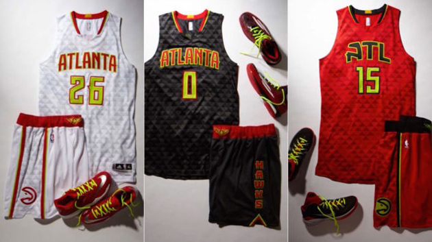
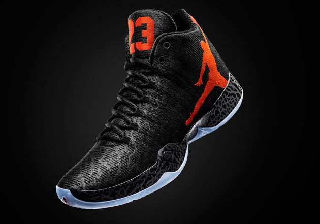
Any worthy sneaker head undoubtedly possesses a closet, room, or separate structure in Nick Young’s case, housing a wide variety of stylish footwear on display and occasionally read for wear. Typically, numerous brands are represented, however, there is one that is unlike the others. Jordan Brand reigns supreme with most sneaker aficionados. Often the release of a new design is anticipated with the most baited of breath and subsequent multi-block lines, leaving parents questioning their children’s life choices. This year is no different, except it is. 2016 marks the 30th anniversary of the coveted shoe and following on the heels of a fan favorite, the Jordan XX9 (Which is hot fire, shown two pics down), the unveiling of the this year’s iteration had a little more hype than usual. With much fanfare and celebration, the design has been released.

The Jordan 30 "XXX" has arrived, not yet in stores but the design has been officially revealed by Nike and worn by Oklahoma City Thunder point guard Russell Westbrook in game.

As usual, we’ll review the shoe on style alone, realistically that’s all that can currently be done, since the sneaker has yet to arrive in stores. At first glance, the similarity between this shoe and the previous version is quite evident. It appears as if the 30 is not the revolutionary change many expected, rather an evolution of the design that so many enjoyed.

The Jordan 30 "XXX" has arrived, not yet in stores but the design has been officially revealed by Nike and worn by Oklahoma City Thunder point guard Russell Westbrook in game. Here we see the previous version the XX9.

Is that a good choice? It’s definitely a safe choice, or at least it was likely perceived to be, but does it neglect the nature of the anniversary and seminal moment in the brand’s existence? To say that fans of the line were expecting a breath of fresh air is an understatement. To mark the third decade of the basketball footwear’s supremacy with a continuation of a previous version could likely be viewed as a misstep. Nonetheless, let’s get to the details.

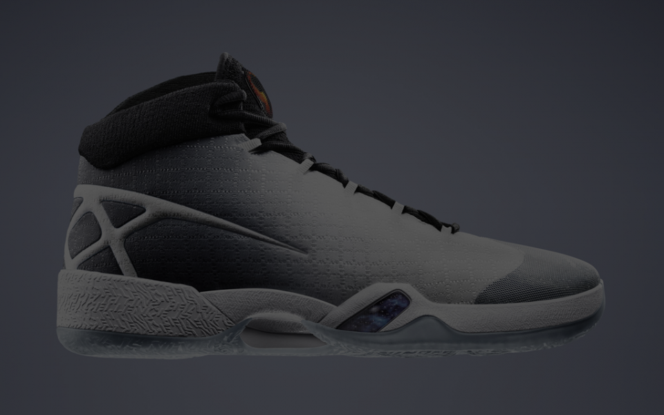
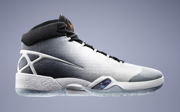
The colorway is again a safe entry. Black and white rarely offer much in the way of stylistic roadblocks, the shoe will match most uniforms and apparel with relative ease. Surely there will be a later offering featuring a black and red color palette, a Jordan Brand staple. Yet it is surprising to see the color red completely vacant. The eye tends to lean to the back of the shoe, focussing on the hard slashes emerging from the rear. They appear to create the shape of a net, an obvious visual cue to the sport they are associated with. It is when viewed from behind that the intent unfolds.

The Jordan 30 "XXX" has arrived, not yet in stores but the design has been officially revealed by Nike and worn by Oklahoma City Thunder point guard Russell Westbrook in game.

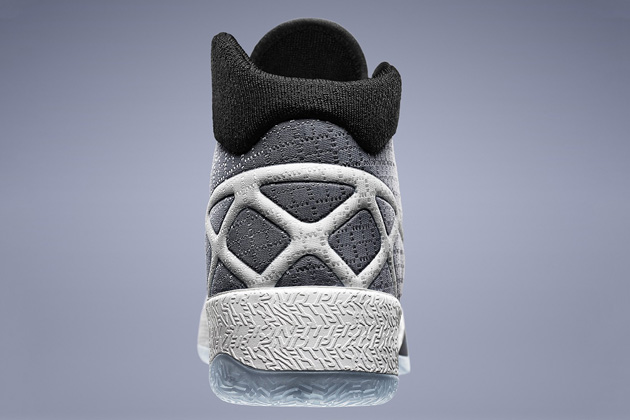
The hard, slashing lines are the extension of the “XXX” emblazoned on the back of the sneaker, the Roman numeral translation of the shoe’s anniversary. Sure, that’s the intent, but it’s not the most aesthetically pleasing delivery. We can agree that the triple “X” serving as a graphical merging of numbering and the visual of the net, is a neat idea, just not flawlessly executed. It looks like the first sketch, rough, but purposeful, that after months of revisions was reverted back to when no greater option could be created. As this truly is the key design element, the success of the shoe really falls upon it’s shoulders. The rest of the shoe is a serviceable presentation, no major errors or standouts, unfortunately shining the spotlight on the questionable graphical direction. Risky waters to say the least.

Oh but there is one feature not to be overlooked. Did you see it? Take a closer look.

The Jordan 30 "XXX" has arrived, not yet in stores but the design has been officially revealed by Nike and worn by Oklahoma City Thunder point guard Russell Westbrook in game.

That miniature nebula, that minute window into the vast expanse of cosmic wonderment is an absolute thing of beauty. The Jordan Brand sneaker is not the only relevant anniversary to the greatest basketball player of all time this year. Twenty years ago a little movie titled “Space Jam” hit theaters. A cinematic tour de force though it may not be, we all love it. The subtle design note, simply must be a hat tip to the film, but leaves me wondering what the Jordan 30 could have been, had this been pushed further. Couldn’t that pattern have been implemented more prominently? I’m sure there was a fear of overdoing it, that perhaps a wink is better than a stare, this is often the case in the design process. But this is the Jordan 30. Time to go all out. Hopefully there will be a full on, spaced out version of the 30, there has to be. Until then we are left with a perfectly fine, nice looking, but underwhelming result.

The Jordan 30 "XXX" has arrived, not yet in stores but the design has been officially revealed by Nike and worn by Oklahoma City Thunder point guard Russell Westbrook in game.

Style

KD8’s Are Out

July 19, 2015 — by Erich Schubert0

Kevin_Durant_KD8_Sneaker_Review-960x636.jpg

There are certain kicks synonymous with current and innovative style, remaining affixed in the forefront of street style and design. Nike’s KDs reside in that realm. Jordans, Air Force Ones, Chucks, to name a few, are staples, tried and true confidants that no matter the gear, will rock along accordingly. It’s impossible to wear KDs and not at least appear to be an individual who has procured a significant street fashion relevance. You could wear a burlap potato sack and some KDs and people would say, “Dudes got some nice shoes.” Durant isn’t the best player in the NBA, that title goes to Lebron, even Steph Curry is rocking Under Armours in all their “we-must-protect-this-house” Under Armourdness. KD exists as an elusive roundball unicorn, so unique that his exemplary skills outshine his flaws, even when compared to the pinnacle of the sport. His shoes are no different. It’s undeniable KDs are just straight up cool, but his new kicks take a small step back. (As noted in other articles, this is purely a style review, size 11.5, send em and I’ll review them fully.)

Nike has released the newest version of one of their signature shoes, the KD8, sure to be a fovrite with sneaker heads everywhere, this version is specialized for the fourth of July.

Above are the “Fourth of July” edition of the KD8s, which now feature Nike’s patented Flywire technology, which will undoubtedly add several feet to your vertical leap and shave minutes off of your mile time. We all know Nike is pretty good at this whole sneaker making thing, save me the specs and show me the colorways! The KD8s continue the lowtop trend of previous iterations, spitting in the collective faces of oldheads and basketball purists worldwide, who still deflect all suggestions that sneaker tops should end anywhere below the hip. The overall look of the shoe is a timid delivery of riskless composition, that results in an adequate. but unimposing and forgettable end product. What’s up with that jutting out heel anyways? Thats not to say the KD8s are a bad looking shoe, by no means is that the intent. Simply, when you set the bar as high as the KD6, you run the risk of perpetual comparison and subsequent disappointment.

Nike released the KD6 two years ago and it still serves as Kevin Durant's best sneaker with the athletic apparel manufacturer.

A popular term in today’s global sports market, consider this a “bridge year” for the KDs. The KD8s are no indictment upon the brand itself, not a misstep but a lateral move, a finished product that is simply underwhelming for expectant feet. Nike is a clever beast and is never one to rest on it laurels, expect them to, at some point, release a colorway that will render all previous statement null and void. The design is strong with that one. The current KD8 is the base model, the premiums aren’t on the showroom floor yet. Honestly they could just release an edition with a photo of Durant while giving his MVP speech, emblazoned upon the side of the shoe and it’ll be a wrap. Expect bigger things from Nike, while other sectors of may be more profitable, there are none cooler than KD.

Style

Rating The Rebrandings

June 30, 2015 — by Erich Schubert1

new_nba_logos_featured-960x600.jpg

The NBA’s global popularity has skyrocketed over the past decade, basketball is the second most popular sport in the world and our stars are recognized in the most obscure corners of the earth. However, the strive for greater brand recognition is never ending, a fresh look recaptures an already captive audience and creates an aura of rebirth and progress. A handful of teams have begun their rebranding process this season with fresh logos and/or uniforms. Some are greater than others, let’s take a look at the best first, shall we?

Milwaukee Bucks – A

The Milwaukee Bucks have designed a new logo and uniforms for the 2015 NBA season, the look great.


Ask most hardcore or casual basketball fans to name ten franchises and, unless they’re wearing a block of cheese as a hat, the Bucks are unlikely to be mentioned. The Bucks play in a small market, are greatly overshadowed by their NFL counterpart, the Packers and don’t have a rich history of winning. Perfect opportunity to reinvent yourself. With an extraordinarily talented, youthful core featuring Jabari Parker, Giannis Antetokounmpo, Michael Carter Williams, Khris Middleton and John Henson, the iron was smoldering and the Bucks wisely struck. The Bucks new primary logo features an angrier deer with a subtle “M” for a neck, continuing the trend they implemented on their court, this past season. Some design genius in the organization adapted their initials, aware that the lettering doubles as an “M” for Milwaukee, or a “W” for Wisconsin.

The Milwaukee Bucks have designed a new logo and uniforms for the 2015 NBA season, the look great.

The Home uniform is clearly stronger than the away. The light blue accent is a wonderful small touch, but both are well executed and stand out on their own. Well done design team. But let’s always try and find a way to use the classic happy, sitting deer logo somehow, OK?

The Milwaukee Bucks have designed a new logo and uniforms for the 2015 NBA season, the look great.


Philadelphia 76ers – B-

The Philadelphia 76ers have designed a new logo and uniforms for the 2015 NBA season, the look ok, but the new logo is great.


The new uniforms are simple and clean, nothing to complain about, but definitely nothing remarkable. In all honesty the jerseys are pulling the grade down, but that Ben Franklin doh. He’s racking the rebrand and putting up some for-real weight. Ben looks like he could cover the entire distance of the court in one second flat. Just look at that dynamic posture. The only negative is that he clearly has his hand in a potential offensive foul position, ready to clear the lane or push off. You’re better than that Mr. Franklin.

Hopefully the 76ers find some way to incorporate the alternate logo somewhere with an alternate jersey. The Ben Franklin logo would surely be too much for daily use, but once in a while, it’s definitely a showstopper.

Los Angeles Clippers – D

The Los Angeles Clippers have designed a new logo and uniforms for the 2015 NBA season, they look terrible.


There’s been a lot of buzz around the Clippers redesign, primarily negative, for good reason, these are bad… Just bad. The new logo is at best a concept sketch, that eventually gets reworked, rethought and eventually used as inspiration for a newer, better concept. It’s just lazy. The uniforms aren’t much better. The home jersey text looks like a weird cousin of the Playoffs Logo with it’s awkward, double convex underline. Simplicity is a style, but not the only one and relying upon it does not promise a fruitful end product. There are rumors that the starkness of the uniform is to prepare for potential jersey sponsorship, to leave room for product placement. That may happen sooner than we think, for now, these just look unfinished.

Atlanta Hawks – B

The Atlanta Hawks have designed new uniforms for the 2015 NBA season, they look cool.


The Atlanta Hawks present NBA fans with a very intriguing entry into the world of uniform design. They emphasized the vibrant red and yellow of their team color palette, abandoning the navy blue and opting for a bolder, black look. The textured fabric is a wonderful departure from the less-is-more school of design that has overtaken the NBA. The red variation is clearly the winner of the three and hopefully will be seen with great regularity. The Hawks also earned extra credit for realizing what we all already knew. They’re never going to come up with something cooler than this.

The old and new logo of the Atlanta Hawks, one of the coolest in the NBA.

Toronto Raptors – F-

The Toronto Raptors redesigned their logo and it looks very similar to the Brooklyn Nets logo.


That’s theirs on the left, in case you didn’t figure that out. Looks familiar though, huh? Hey Toronto, get your own logo! It’s bad enough they’re still saddled with a mascot inspired by a 1993 summer blockbuster. Remember how cool velociraptors were in 1993? They were this awesome dinosaur that none of us new about, don’t pretend like you knew about ’em. We thought it was all T-rex’s, triceratops and stegosauruses, but nah, this dino thinks and remembers. Well it’ll be 2015 when the Raptors fully incorporate this logo into their brand, a long time since we fell in love with the clever girls of Jurassic Park. If their swiped logo isn’t bad enough, there are rumors that there will be an alternate version of their as of yet unreleased uniforms labelled, “Drake Version.” Corny.


Style

Jordan XX9 – Hare

June 29, 2015 — by Erich Schubert1

hare_featured-960x428.jpg

Time to debut a new feature on Off Court Issues, there is no denying in today’s landscape that fashion and the NBA are star crossed lovers, walking hand in hand, joined at the hip. So, just like when Karl Malone played that one season for the Lakers, why not hop on board. We’ll be looking at a new colorway for the Jordan XX9 and since I don’t have these sneakers, we’ll be evaluating them on style alone. Now if a pair of 11.5’s happened to show up on my doorstep, I would be more than happy to give them a proper run through and thorough investigation.

The Jordan XX9 rolled out in September, 2014 and it was sick, just look at this thing.

jordan_xx9


Many of us adults harken back to our youthful days when there was no more coveted a pair of kicks than the elusive Air Jordan. We all have our favorites and there are some inarguable classics  (I’m looking at you VI and XI). There is little doubt that the Jordan XX9 will fall right into the latter category of well designed and executed footwear artistry. The cropped, oversized logo and number flashes in luminescent red/orange glory, vibrantly juxtaposed against brooding black on black fabric.

When this shoe dropped, so did jaws. On may 16th prepare to bolster your mouthpiece once again when this little bad boy ships to high end sneaker peddlers everywhere.


hare_full


These puppies have Westbrook, who is Team Jordan, written all over them. I fully expect to see him wearing an entire three piece suite with this color pattern continued throughout.