The NBA’s global popularity has skyrocketed over the past decade, basketball is the second most popular sport in the world and our stars are recognized in the most obscure corners of the earth. However, the strive for greater brand recognition is never ending, a fresh look recaptures an already captive audience and creates an aura of rebirth and progress. A handful of teams have begun their rebranding process this season with fresh logos and/or uniforms. Some are greater than others, let’s take a look at the best first, shall we?
Milwaukee Bucks – A

Ask most hardcore or casual basketball fans to name ten franchises and, unless they’re wearing a block of cheese as a hat, the Bucks are unlikely to be mentioned. The Bucks play in a small market, are greatly overshadowed by their NFL counterpart, the Packers and don’t have a rich history of winning. Perfect opportunity to reinvent yourself. With an extraordinarily talented, youthful core featuring Jabari Parker, Giannis Antetokounmpo, Michael Carter Williams, Khris Middleton and John Henson, the iron was smoldering and the Bucks wisely struck. The Bucks new primary logo features an angrier deer with a subtle “M” for a neck, continuing the trend they implemented on their court, this past season. Some design genius in the organization adapted their initials, aware that the lettering doubles as an “M” for Milwaukee, or a “W” for Wisconsin.
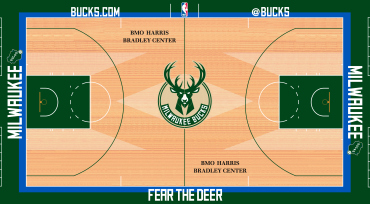
The Home uniform is clearly stronger than the away. The light blue accent is a wonderful small touch, but both are well executed and stand out on their own. Well done design team. But let’s always try and find a way to use the classic happy, sitting deer logo somehow, OK?
![]()
Philadelphia 76ers – B-

The new uniforms are simple and clean, nothing to complain about, but definitely nothing remarkable. In all honesty the jerseys are pulling the grade down, but that Ben Franklin doh. He’s racking the rebrand and putting up some for-real weight. Ben looks like he could cover the entire distance of the court in one second flat. Just look at that dynamic posture. The only negative is that he clearly has his hand in a potential offensive foul position, ready to clear the lane or push off. You’re better than that Mr. Franklin.
Hopefully the 76ers find some way to incorporate the alternate logo somewhere with an alternate jersey. The Ben Franklin logo would surely be too much for daily use, but once in a while, it’s definitely a showstopper.
Los Angeles Clippers – D
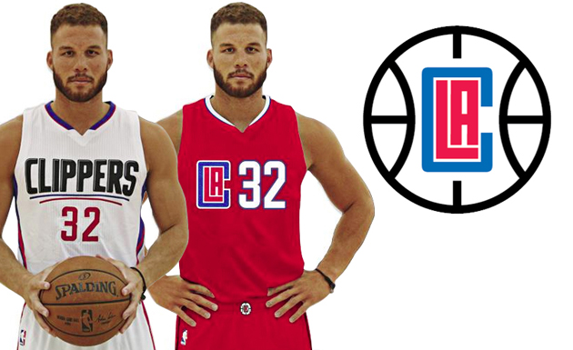
There’s been a lot of buzz around the Clippers redesign, primarily negative, for good reason, these are bad… Just bad. The new logo is at best a concept sketch, that eventually gets reworked, rethought and eventually used as inspiration for a newer, better concept. It’s just lazy. The uniforms aren’t much better. The home jersey text looks like a weird cousin of the Playoffs Logo with it’s awkward, double convex underline. Simplicity is a style, but not the only one and relying upon it does not promise a fruitful end product. There are rumors that the starkness of the uniform is to prepare for potential jersey sponsorship, to leave room for product placement. That may happen sooner than we think, for now, these just look unfinished.
Atlanta Hawks – B
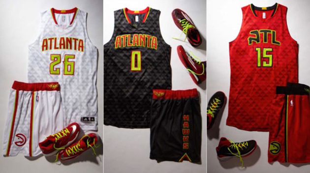
The Atlanta Hawks present NBA fans with a very intriguing entry into the world of uniform design. They emphasized the vibrant red and yellow of their team color palette, abandoning the navy blue and opting for a bolder, black look. The textured fabric is a wonderful departure from the less-is-more school of design that has overtaken the NBA. The red variation is clearly the winner of the three and hopefully will be seen with great regularity. The Hawks also earned extra credit for realizing what we all already knew. They’re never going to come up with something cooler than this.
![]()
Toronto Raptors – F-

That’s theirs on the left, in case you didn’t figure that out. Looks familiar though, huh? Hey Toronto, get your own logo! It’s bad enough they’re still saddled with a mascot inspired by a 1993 summer blockbuster. Remember how cool velociraptors were in 1993? They were this awesome dinosaur that none of us new about, don’t pretend like you knew about ’em. We thought it was all T-rex’s, triceratops and stegosauruses, but nah, this dino thinks and remembers. Well it’ll be 2015 when the Raptors fully incorporate this logo into their brand, a long time since we fell in love with the clever girls of Jurassic Park. If their swiped logo isn’t bad enough, there are rumors that there will be an alternate version of their as of yet unreleased uniforms labelled, “Drake Version.” Corny.

One comment
We the North
July 10, 2015 at 7:21 pm
You’re killing us. We tried our best, it’s not easy being the only international team in the NBA, cut us some slack.